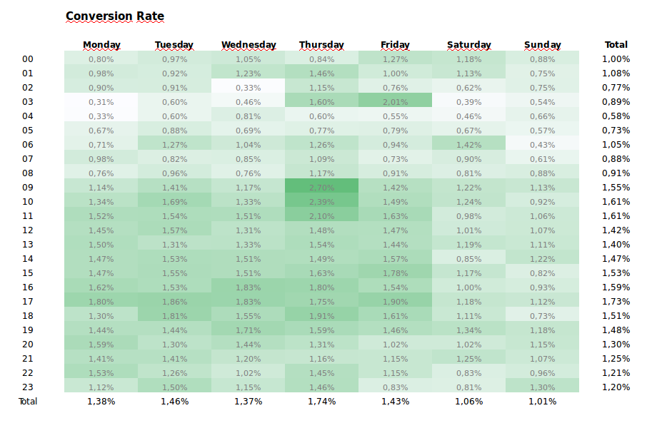
In order to optimize Experian’s lead-generation efforts, I decided to build a conversion rate optimization report. This report showed the conversion rate for each website in EMEA.
Visualized as a heatmap, and broken-down by hour and day, marketers could see in a simple way when were their visitors converting more effectively. This allowed the marketers to take this data into account to optimize several marketing channels. For example, marketers could then adjust their bidding by time of day in Adwords in order to raise the bids during the time of better conversion rates. They could also decide the timing of their email marketing campaigns based on this data. Of course, after a while, these actions would influence the data. But if one wanted to update this conversion rate optimization report, campaign data could be easily filtered out. If campaign traffic was properly tagged, you could calculate the conversion rate of just the organic traffic from search, referrals, social and direct sources.
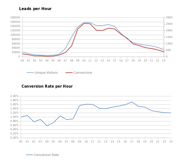
Two other graphs showed the same data as a trend graph. This view allowed marketers to see more clearly that conversions usually took place early morning and early afternoon. This data provided context to the earlier graph, that showed only the conversion rate. With this context, marketers could take more informed decisions. They could balance the conversion rate with the pattern seen in the graph above to confirm that their decisions could have the desired impact.

